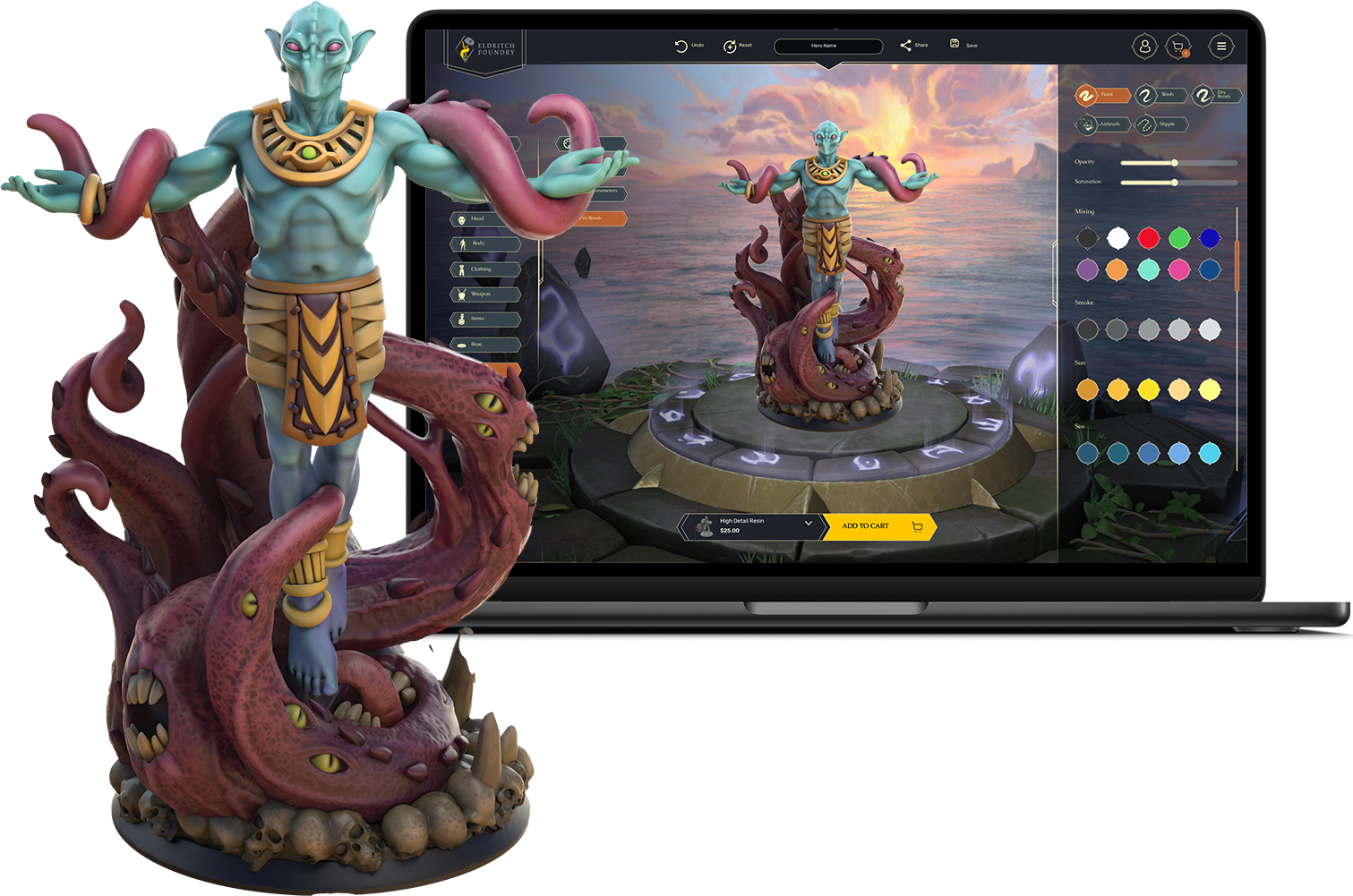
Let’s talk about color. Or more specifically, the kind of color you think you’re getting when you spin your mini around on-screen…versus what shows up in real life after our printers work their magic (and sometimes, their chaos).
We know some of you have been surprised when your printed mini doesn’t quite match what you saw in the builder. Maybe the colors looked muted. Maybe the gold turned out with a less lustrous shine than you were expecting. Maybe it just looked a little…blurrier than you hoped.
First, we hear you. Second, let’s break down what’s going on, and how to get the most out of your color print.
Color Tech Isn’t Magic (Yet)
Here’s the truth: printing in color—especially full-color resin—is still a young technology. It’s kind of like alchemy, if alchemy involved several rounds of debugging, a prayer to the machine gods, and a healthy respect for material physics.
Unlike your screen, which beams light directly into your eyeballs, printed color relies on pigments layered onto material that absorbs, refracts, and diffuses light. What you see online is a vibrant render. What you get IRL is affected by:
The texture and tone of the material itself
The type of resin used in printing
Tiny limitations of detail and pigment layering
How your monitor is calibrated (spoiler: most aren’t)
Where in the printer maintenance cycle your mini was printed
Ambient humidity (yes, seriously. Print quality varies depending on how humid or dry it is during the print).
Whether there are any supports still attached (sometimes necessary, not always pretty)
Metal? Shiny? Well, Not Quite.
We get this one a lot, so let’s be clear: Shiny metals don’t really “print” yet.
The printer tries its best to fake metallics with shading tricks. Think of it like painting non-metallic metal on a mini. It’s not actual silver, it’s layers of gray, blue, and white simulating a reflective surface.
So if you load up your mini with chrome armor, expect something more “cool grayscale gradient” and less “knight-in-blinding-sun-reflections.” That’s the tech limitation, not us slacking. Promise!
Screens Lie, Even Yours
Colors can vary wildly from screen to screen. What looks vibrant on your iPhone might look dusty on a Dell monitor. Your mini is designed in a glowing world of backlit perfection, and then it’s brought into the real world where light behaves like an unpredictable cat.
Also worth noting: printed colors are meant to be appreciated at arm’s length. If you zoom in close and squint, you’ll absolutely see layer lines, pigment speckling, and texture variation. These minis are designed to shine on your game table, not under a magnifying glass.
Also? They don’t photograph great. The pigments can look duller, the details flatter, and shadows harsher in photos than they do in real life.
We do apply light post-processing to help the preview match the printed version better, but it’s not 1:1 yet, and probably won’t be for a while. Even studios like Weta Workshop (yep, those folks behind The Lord of the Rings) have entire departments wrestling with this stuff when translating digital art into print.
Welcome to the joys of cross-media production – bane of artists, everywhere.
What Can You Do?
Until color printing tech levels up, here are a few tips to get the best results:
Use the printer-recommended color presets: changing them will affect how the mini prints. Those presets exist for a reason.
Avoid ultra-light tones (they tend to print washed out)
Color printers work well with heavily saturated tones
Go easy on metallics and gradients
Keep the scale in mind: micro-detail can look clean on screen and blur in reality
Think like a painter: what works in physical painting often works in print, too
We’re Listening (And Tinkering)
We want your minis to be as epic in person as they are in your mind, and we’re actively exploring ways to improve visual previews and post-print quality.
Until then, if you ever receive a color mini that looks way off from what you expected, reach out. We’ll make it right or at least help you understand what happened. You trusted us with your character.
Stay weird, stay bold, and remember: A slightly blurry mini with a great backstory still kicks ass.
